
The 1 January 2015, a new year begins, and the arrival of Metropolises in the French institutional landscape will show up a batch of new logos. If the Lyon Métropole should arrive within 2 or 3 days. Here to begin the Bordeaux Metropole.
A new logo for Bordeaux métropole
![]()
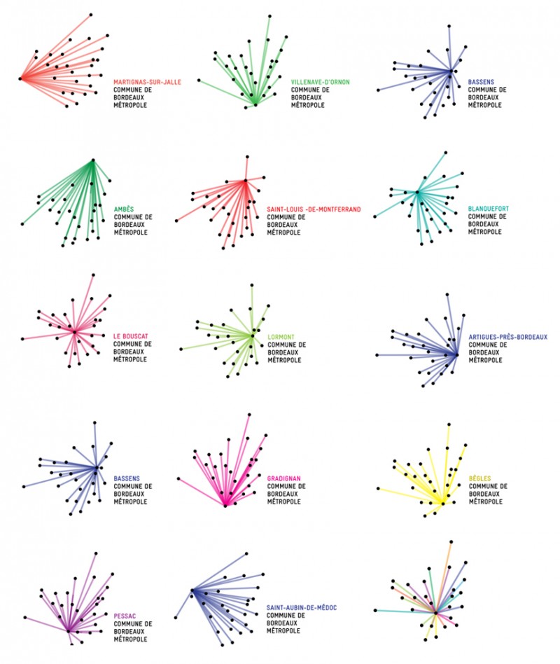
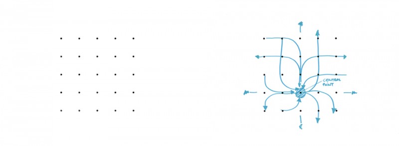
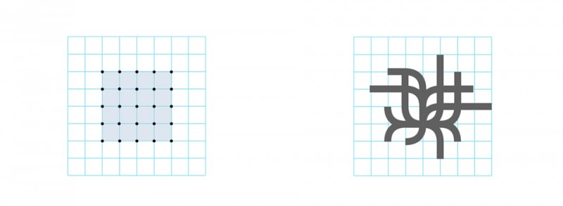
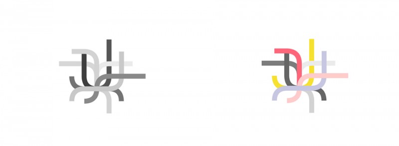
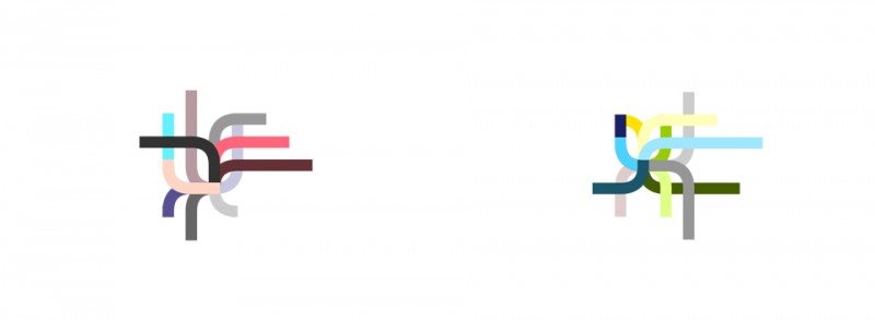
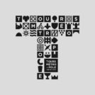
More than a logo, it's a real graphics system which has been proposed by Ruedi Baur. The Franco-Swiss designer, yet very critical in terms of territorial identities, we propose an identity movement in which each of the 28 municipalities of the metropolitan area should be able to identify.
The starting point of this reflection is the geography of the city. Each city is represented by a black dot. These 28 points interconnected by the colored beams is a star whose center varies Common highlighted. The result is a "living" logo that allows every citizen to locate its place of life, while showing his membership in the Metropolis. Thus the logo with the Bordeaux center has not quite the same form as the logo of Parempuyre, Ambes, Gradignan or Saint-Médard-en-Jalles.

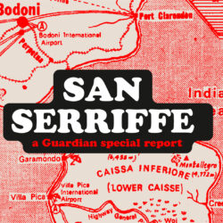 San Serriffe typographic Island
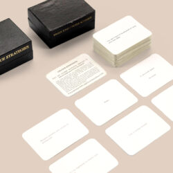 Design, creativity and oblique strategies!
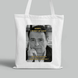 Tote bag, a new social totem?
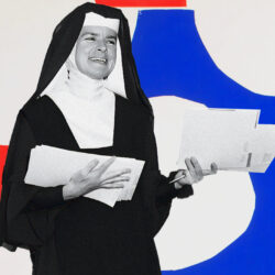 Sister Corita Kent, the Pop Art nun
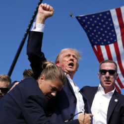 Donald Trump, the martyr who makes history
 Smallicieux – Brand identity
 Les Champs Libres, a cultural connection – Visual identity
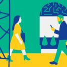 Ministry of Culture – Projet Camus – Visual identity
 Initiall – Naming & visual identity
 Hospital NOVO – Visual identity
 Research for the visual identity of the cultural center CentQuatre-Paris
 Dropbox and Indesign: the end of broken links!
 Rolland Garros in the spotlight
 Donald Trump, the martyr who makes history
 adopte un mec: a new logo for the dating app
Leave a Reply