
![]()
The famous Belgian fast food Quick presents its new logo!
My first thoughts go immediately to the previous logo that has lived 22 years. We will return on his case in the end of this article.
Meanwhile, we quickly find the new logo on all packaging in the course of Q1 2015 and to restaurants pediments in the course of the year. It is a complete overhaul initiated by the new marketing department: new architectural concept, new advertising positioning and above all, what interests us, new logo. It is signed by the agency Carré Noir.
A simpler Q
It is designed to be simpler, more modern and more impacting. The figurative evocation of the house disappears to contain only the initial letter "Q" and the color red. It is in this sense to logos that are increasingly minimalist, where the icon is becoming the official logo.
Indeed, whether for mobile applications icons or icons of social networks, brands must adapt their logo on these new uses. If some use a particular sign of their logo (eg Twitter and bird), other naturally choose the first letter of their name (The "F" from Facebook).
To return to the logo, so you can enjoy the new design of the initial letter "Q" more fluid and balanced than the former, I'm less sensitive to oblique typography name below. In particular, the "Q" seems a bit "heavy". The bar of the "Q" was she forced to go inside the round? not sure ...
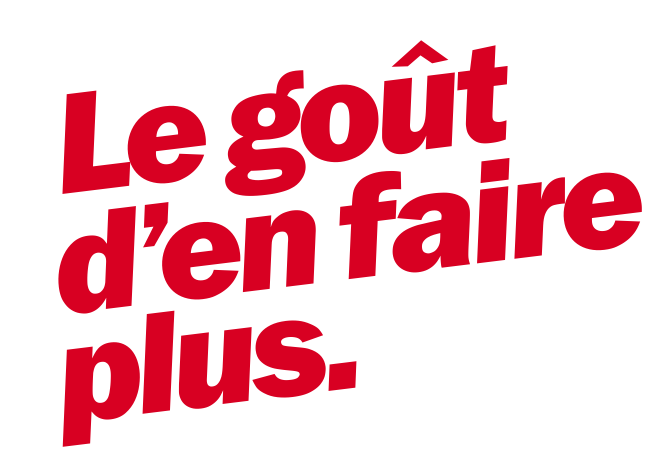
In passing, we note a new signature "le goût d'en faire plus" ("Taste to do more") to replace the (pretentious?) "nous, c'est le goût" ( "We, its the taste"). Personally, I've always preferred "promises" to the "claims". It's probably a matter of taste!
Here is a short clip presenting the new logo.

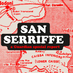 San Serriffe typographic Island
 Design, creativity and oblique strategies!
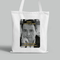 Tote bag, a new social totem?
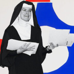 Sister Corita Kent, the Pop Art nun
 Donald Trump, the martyr who makes history
 Smag – Digital agriculture
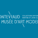 Visual identity of Fontevraud Museum of Modern Art – Cligman Collection
 Groupe Qualiconsult – Visual identity
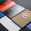 Khalvadjian Lawyers
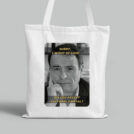 Tote bag, a new social totem?
 Trump was a graphic designer!
 The smart set of ambigrams, graphic symmetry and word reflections
 The symbolism of cut hair in Iranian protest posters
Leave a Reply