

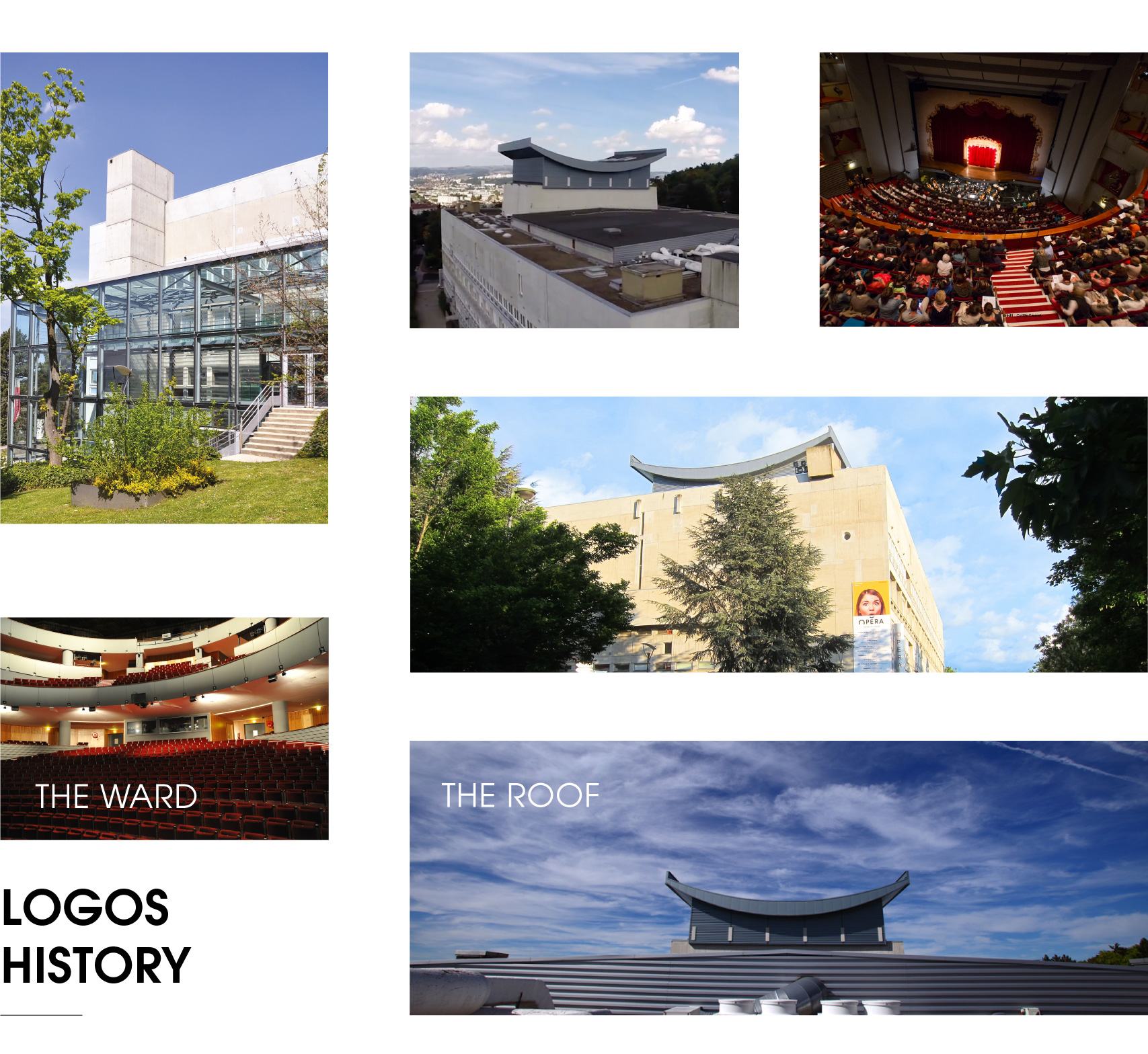
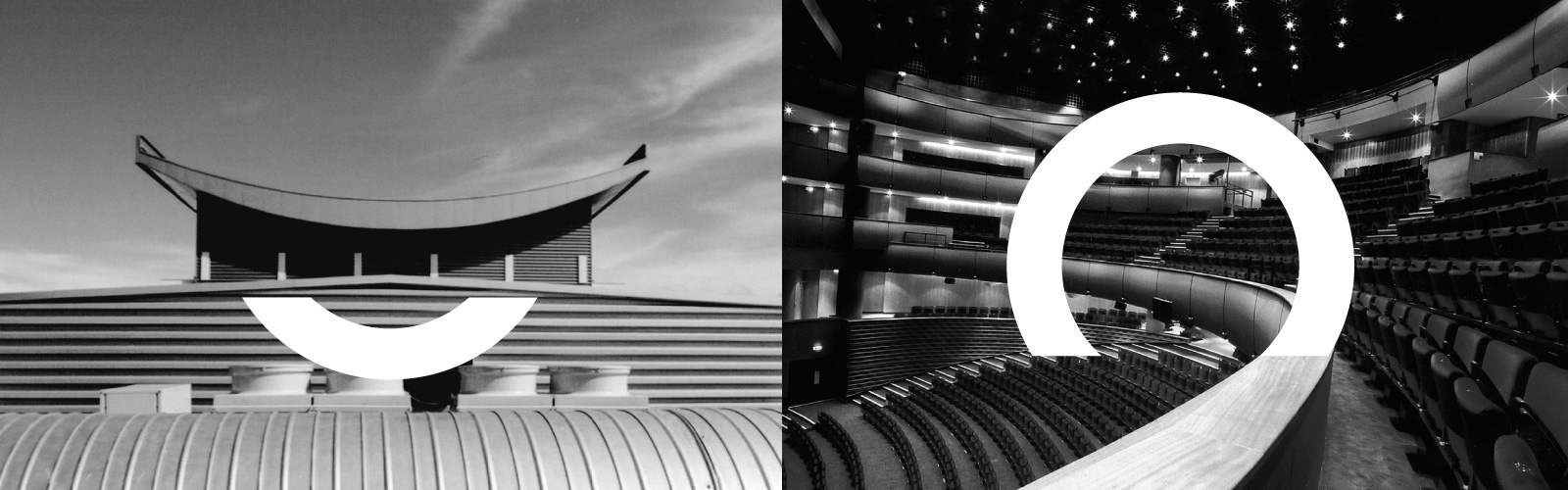
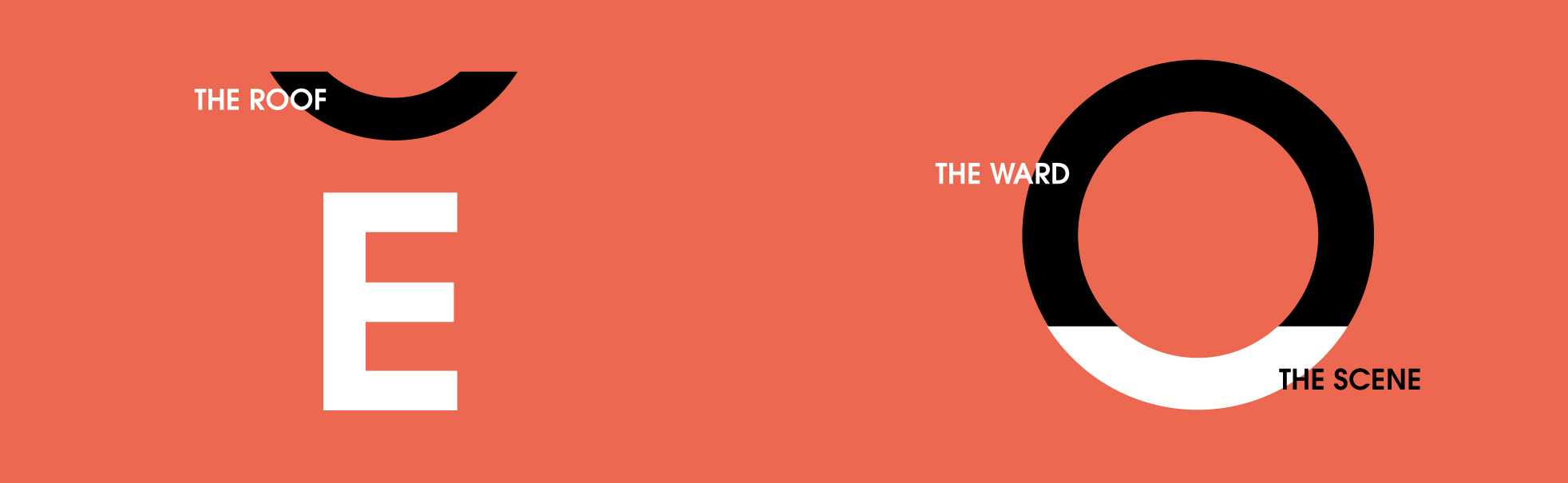
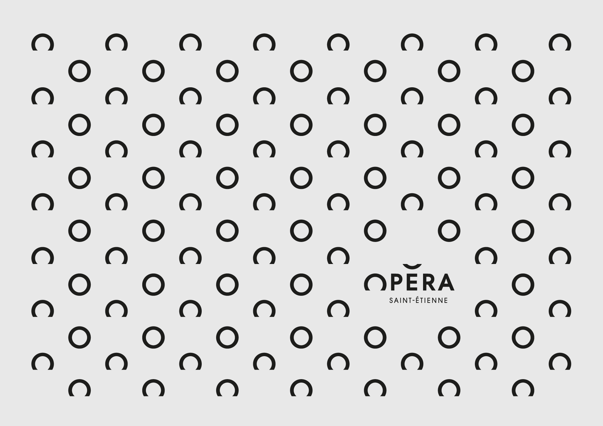
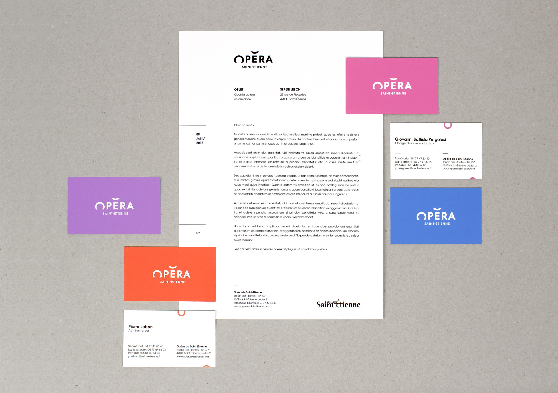
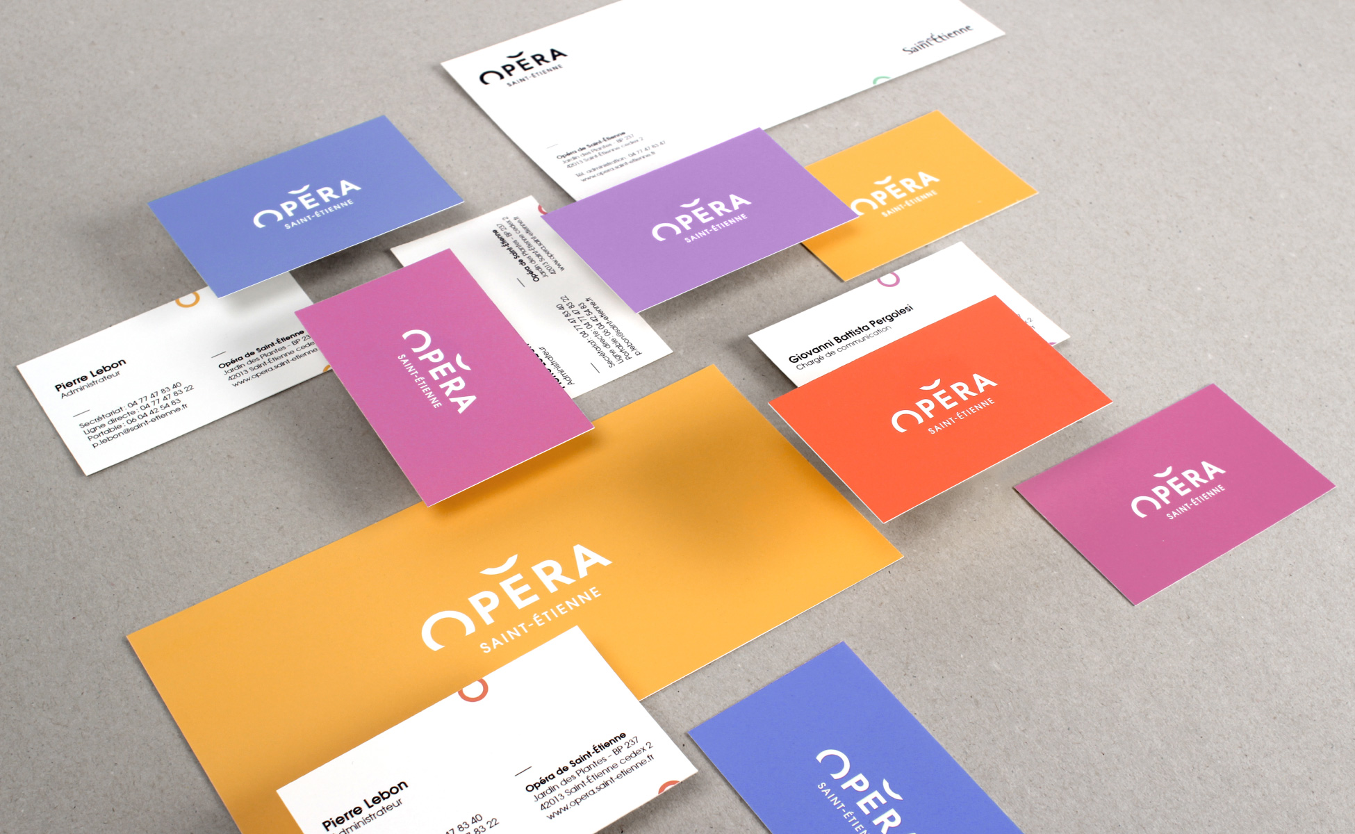
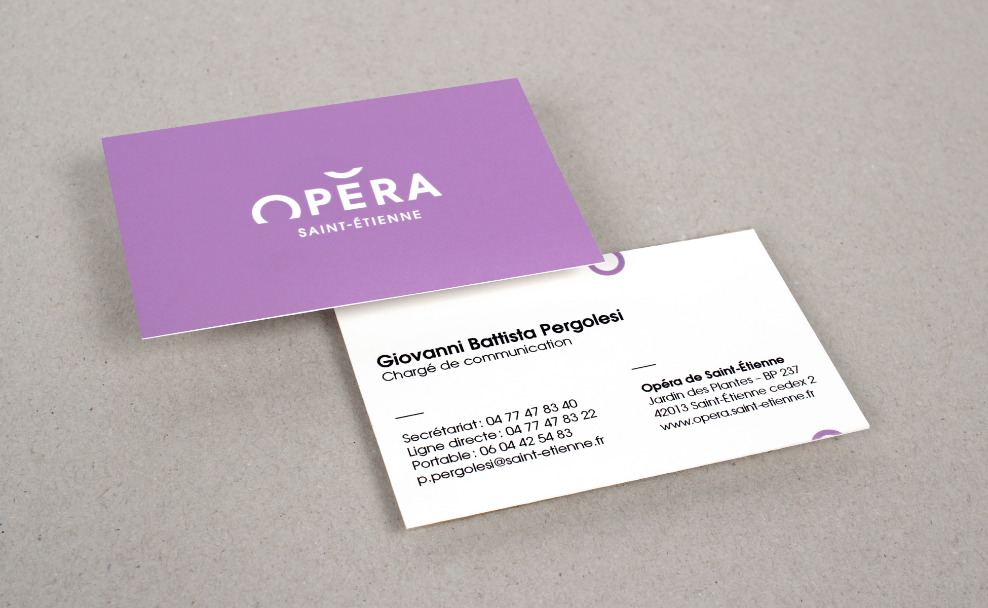
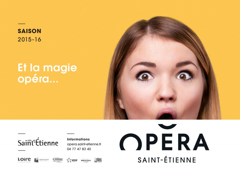
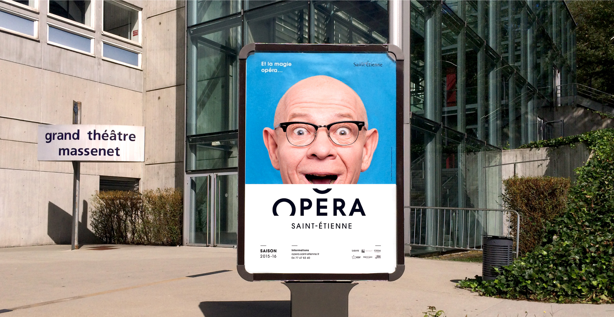
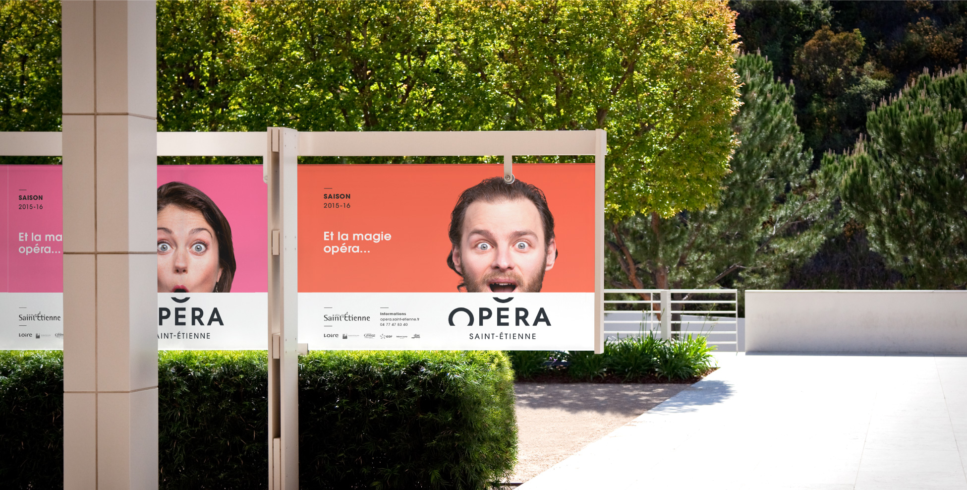
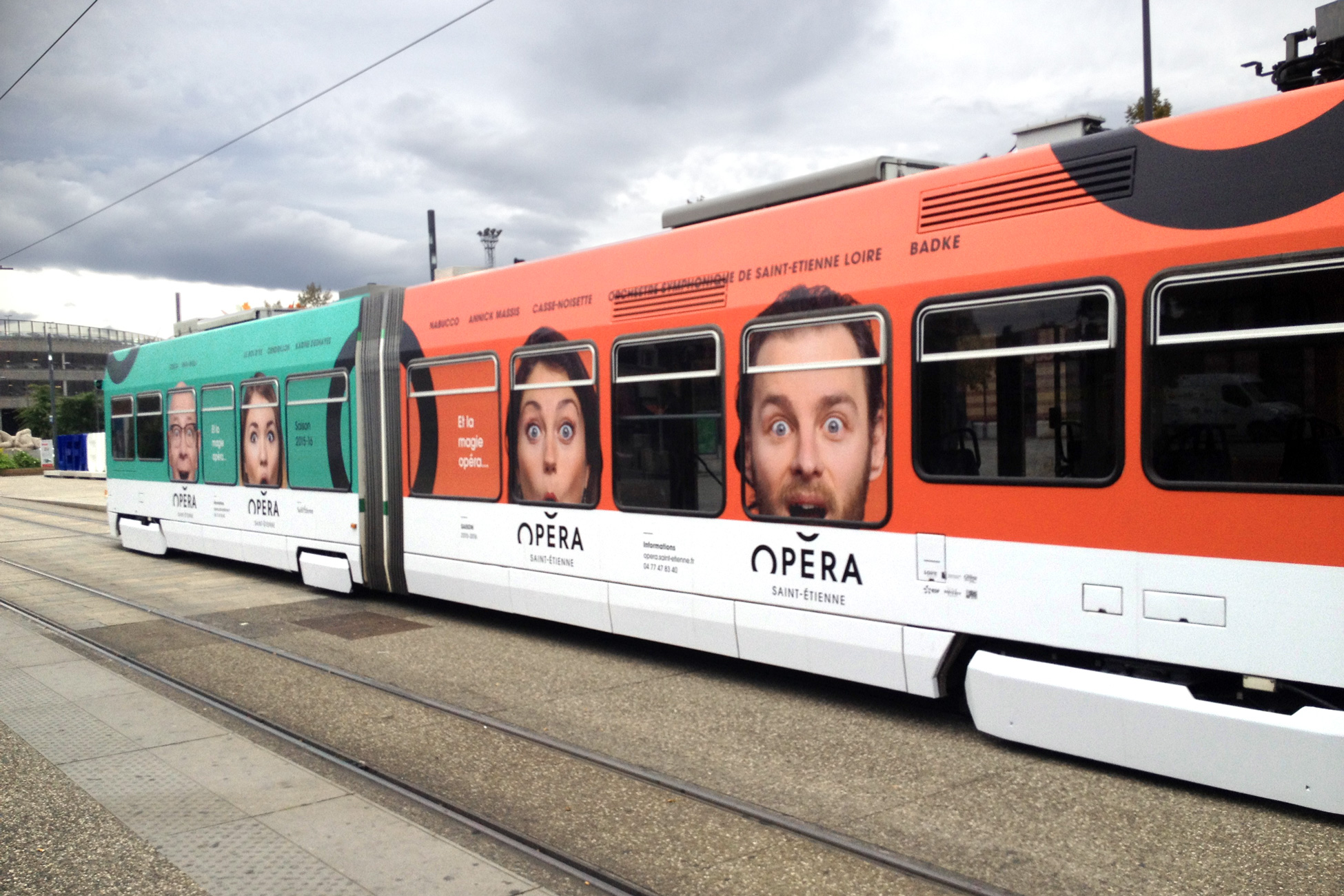
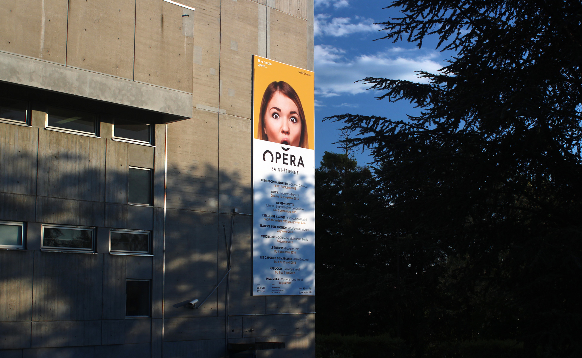
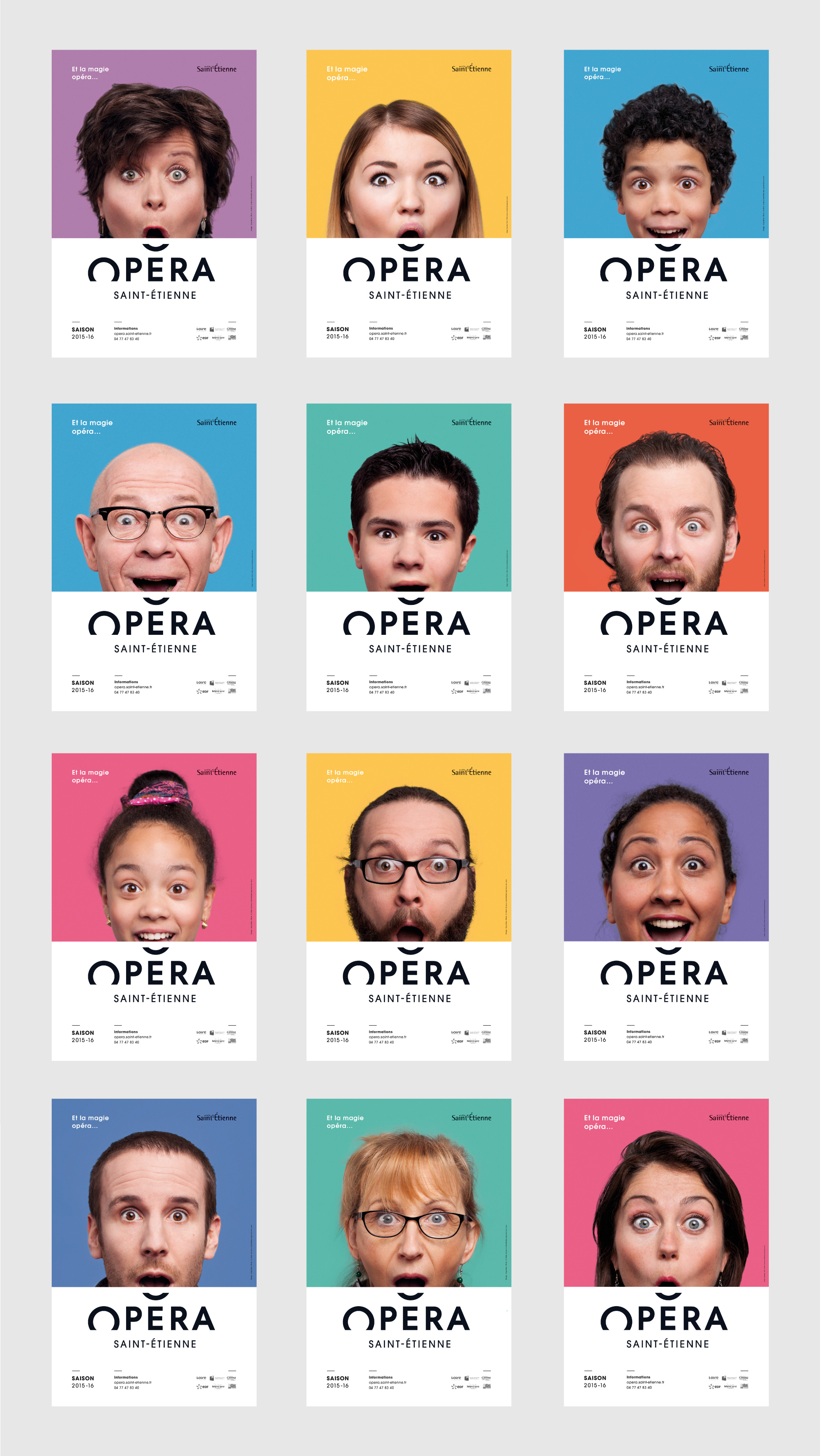
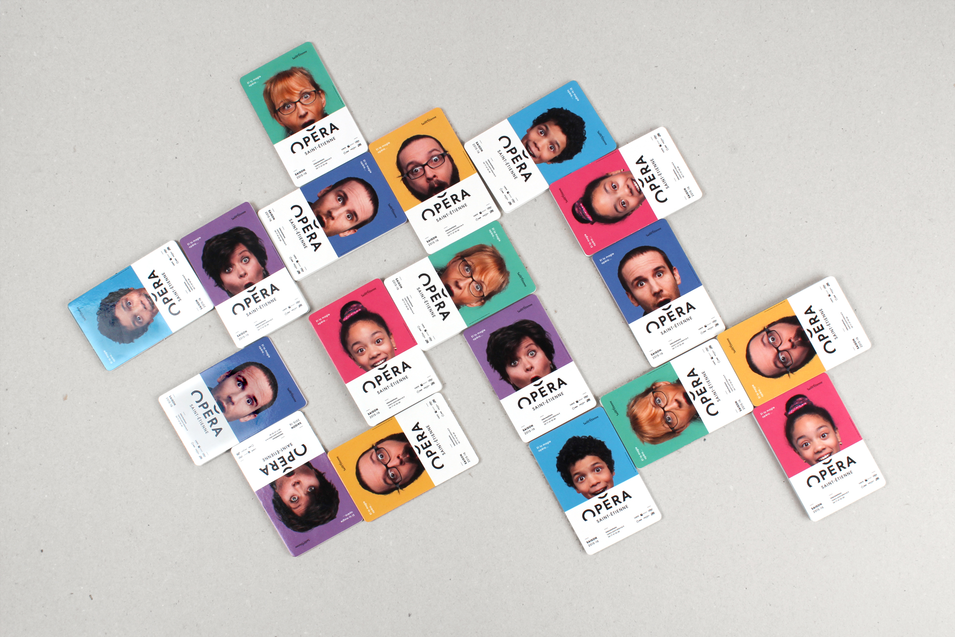
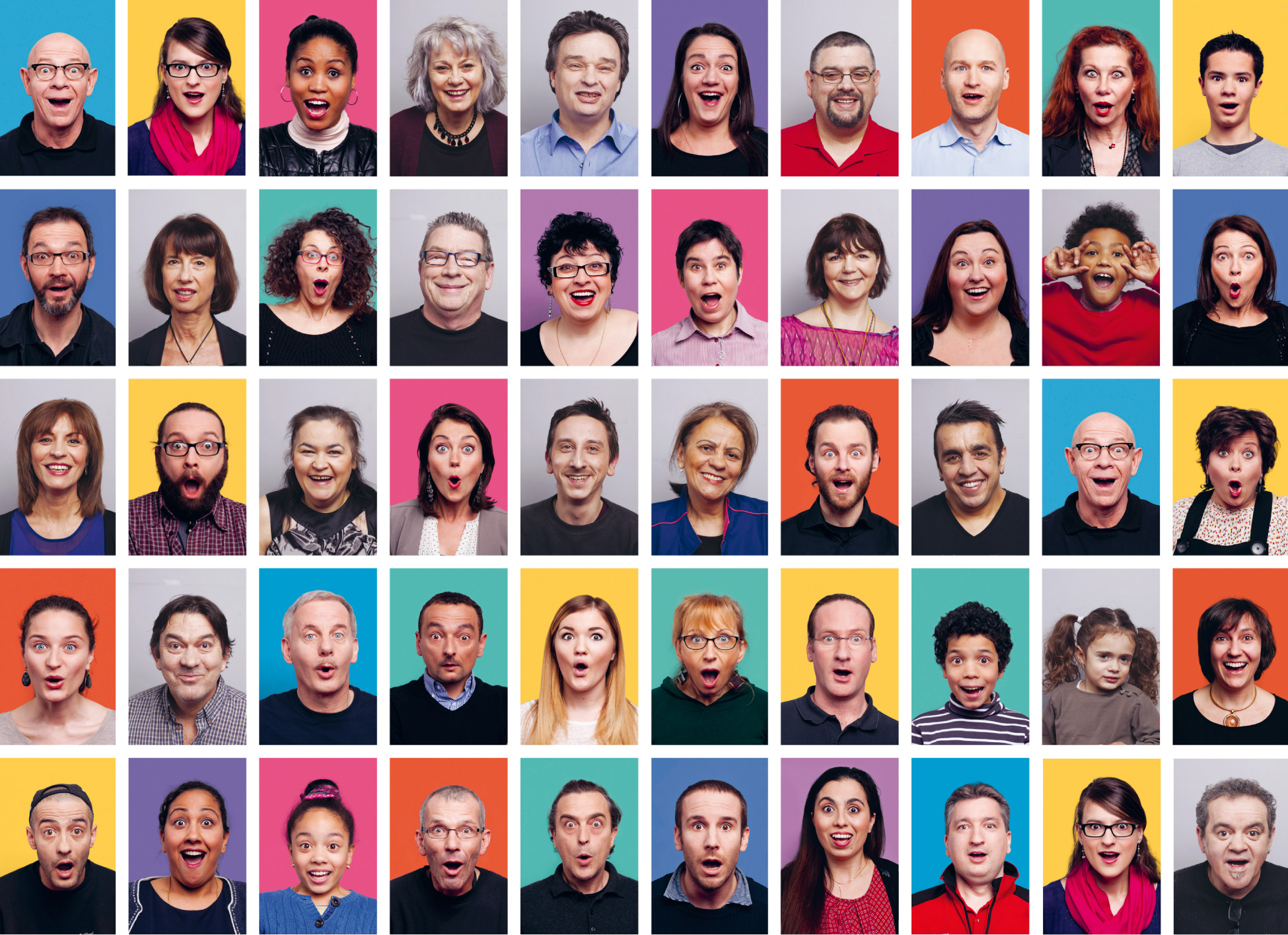
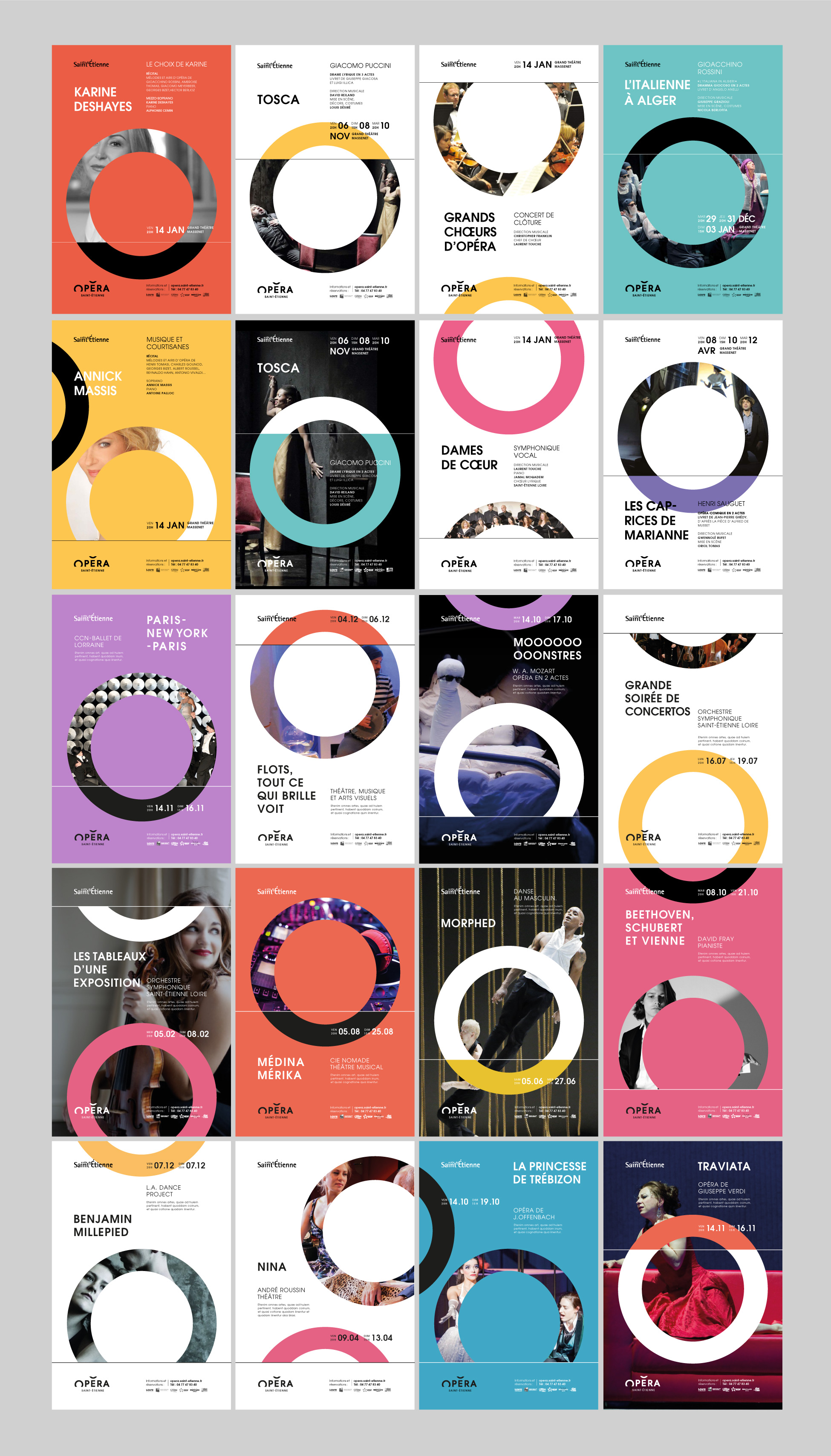
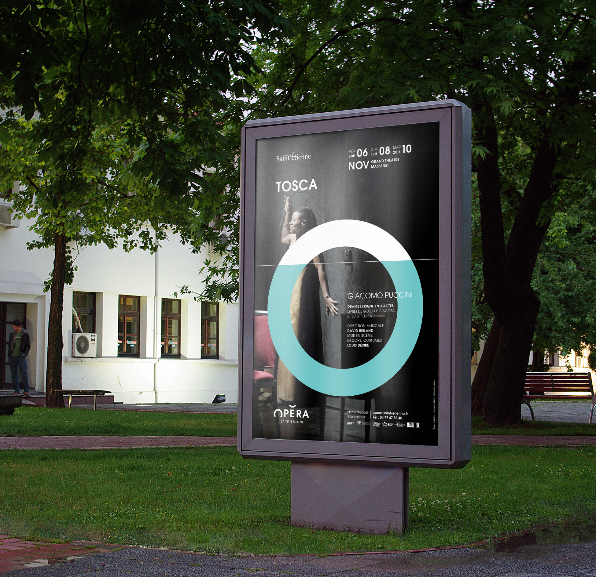
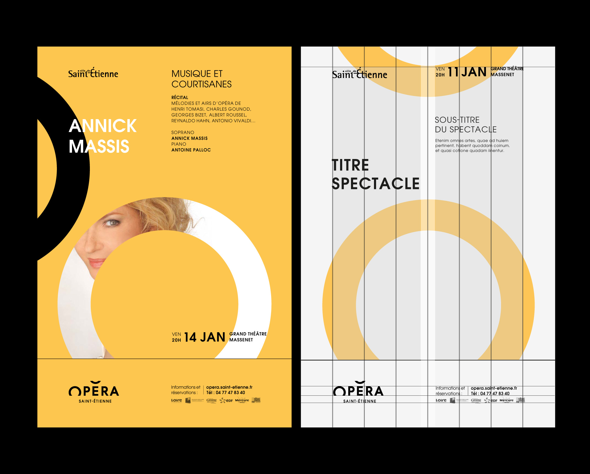
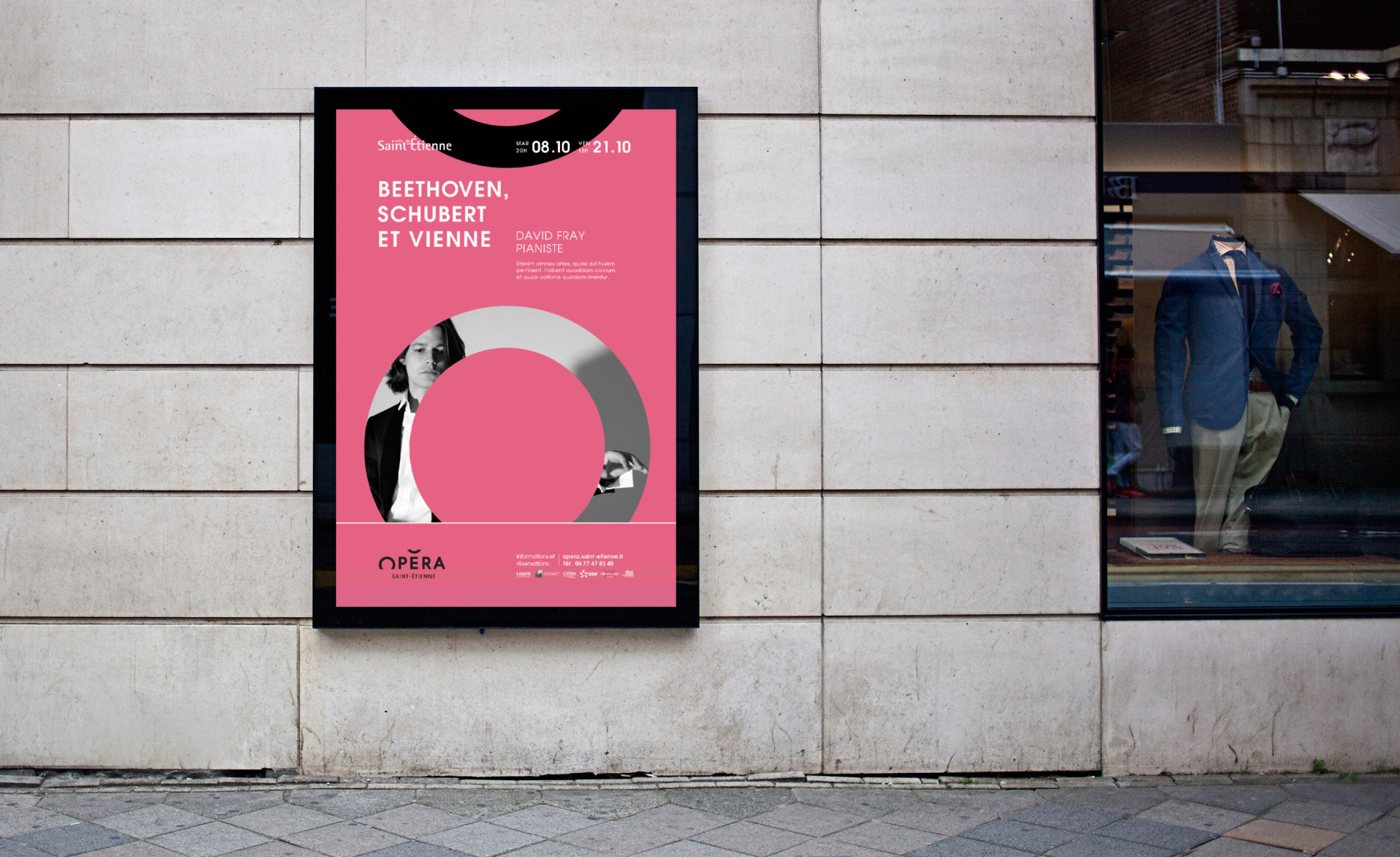
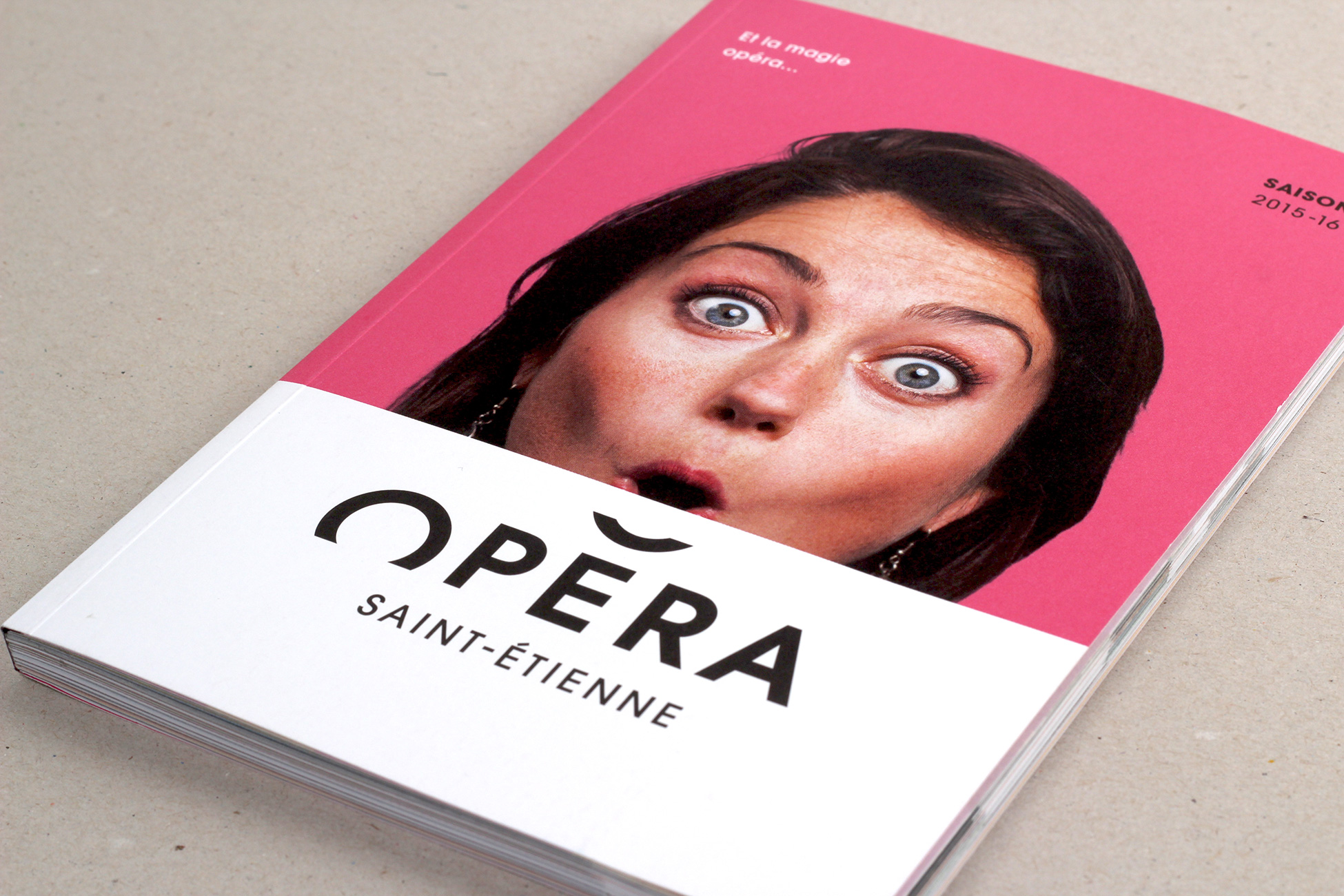
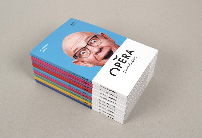
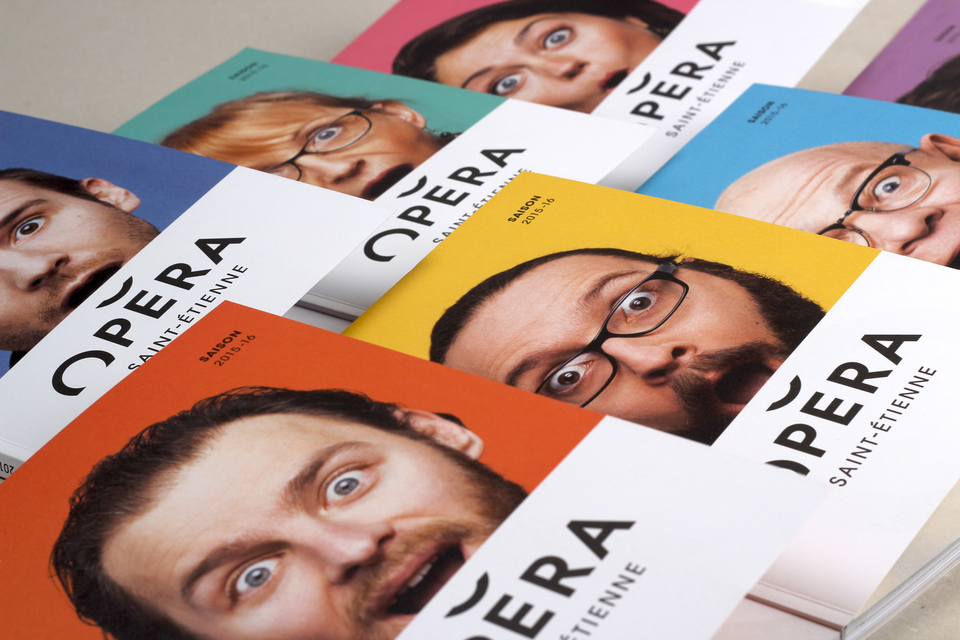
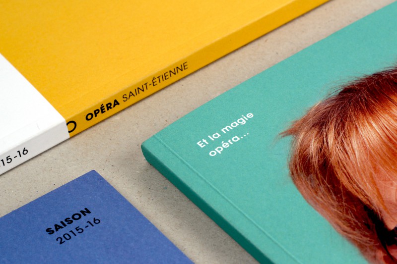
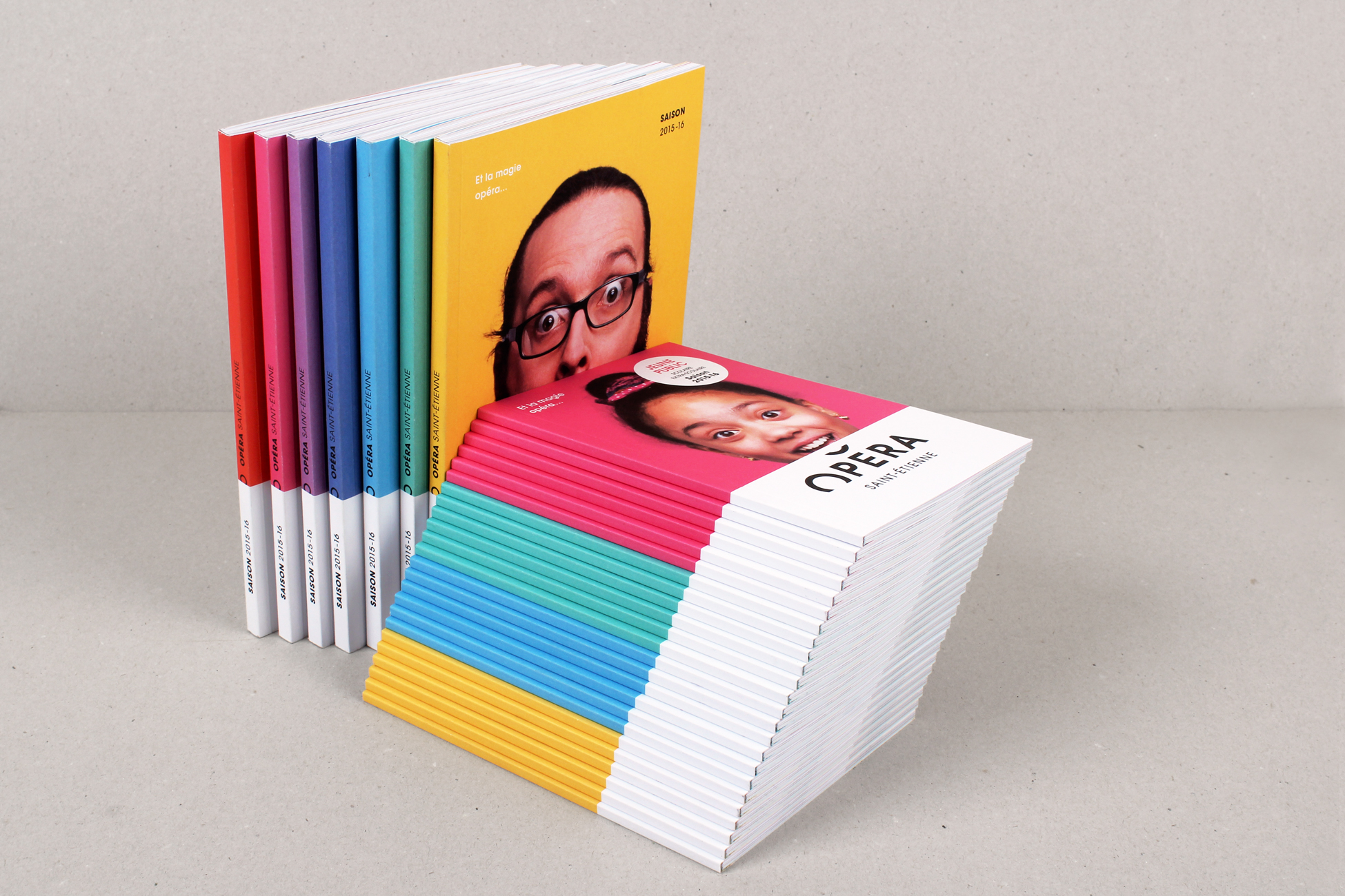
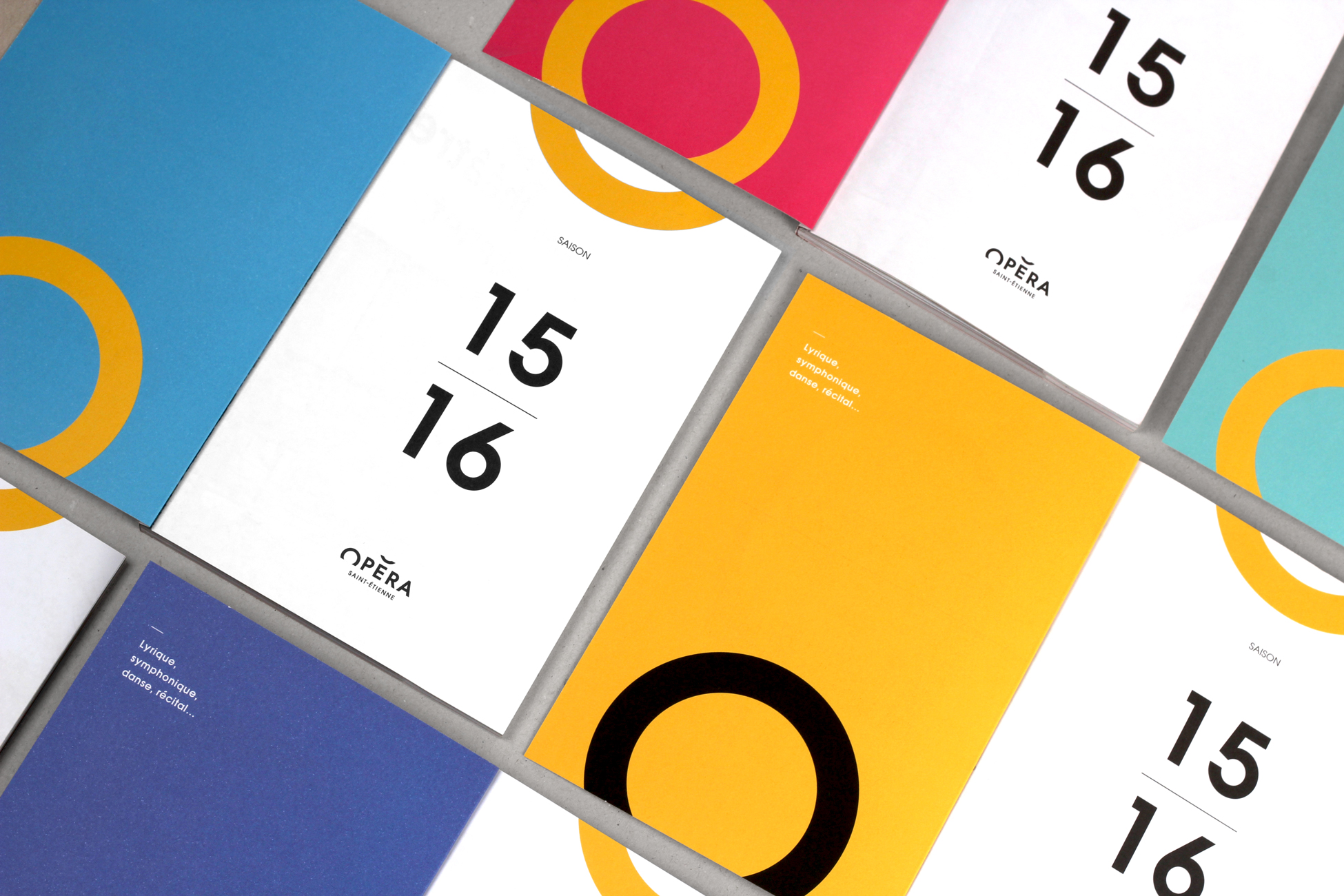
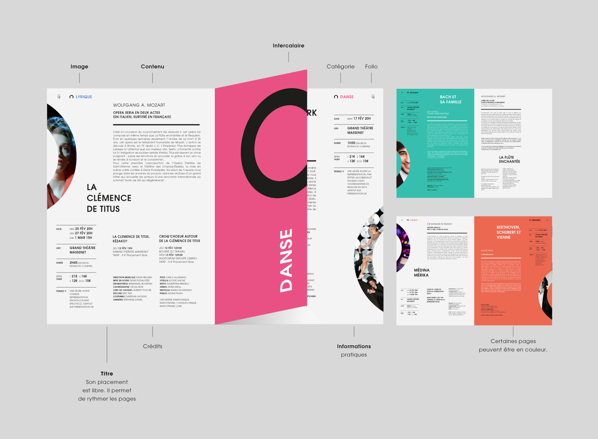
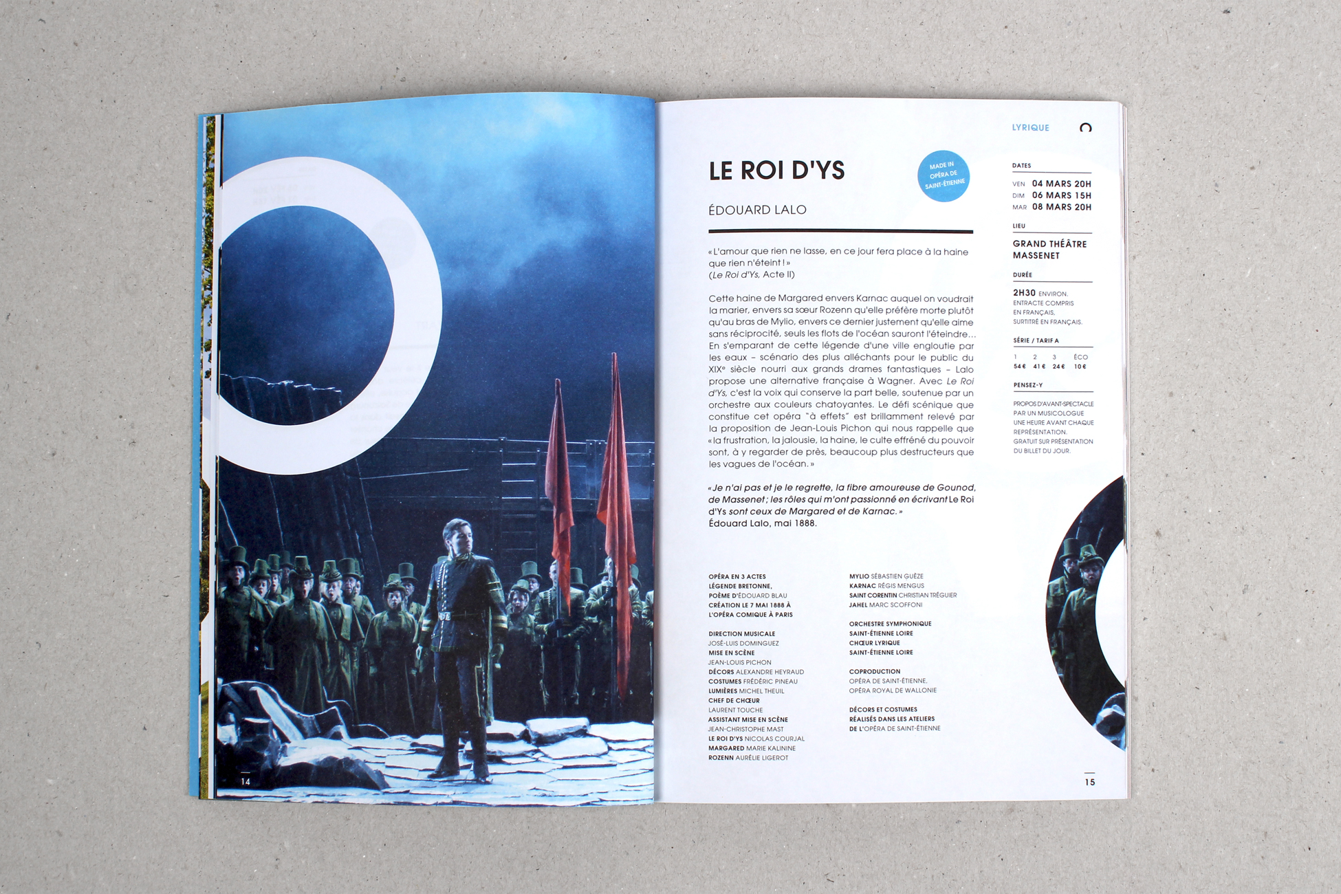
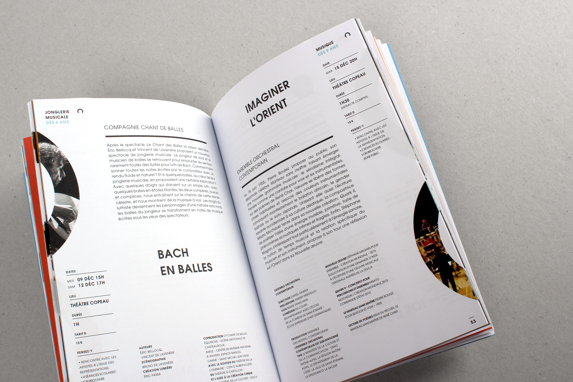
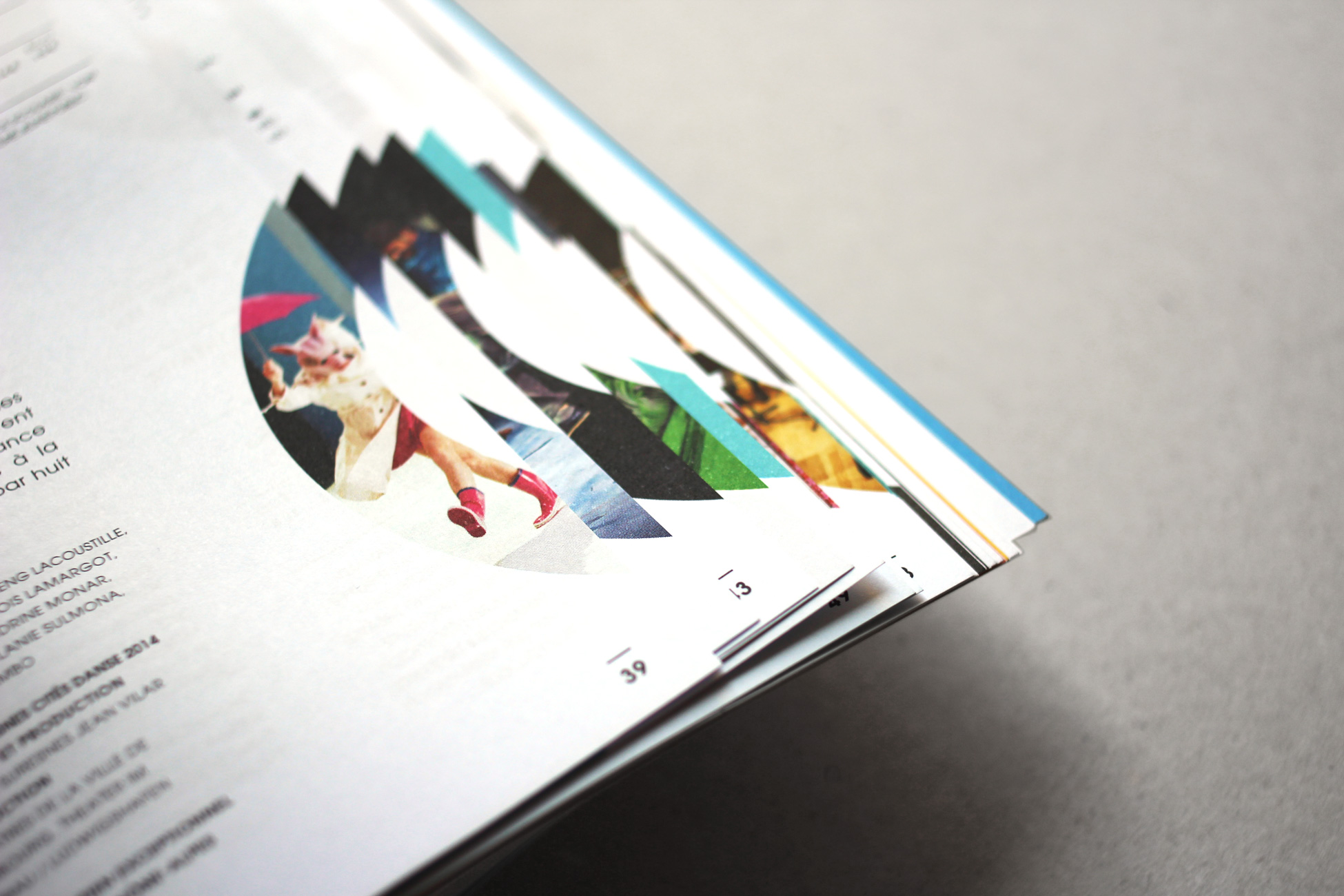
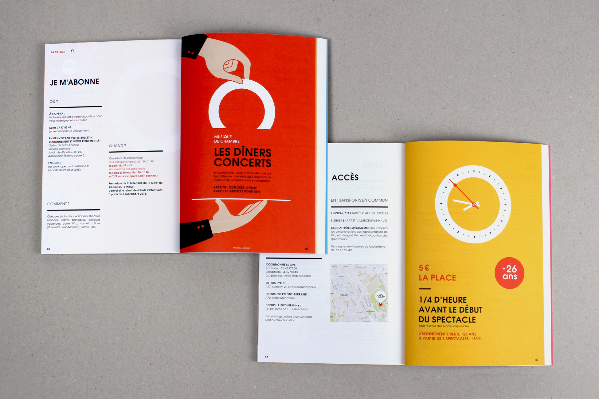
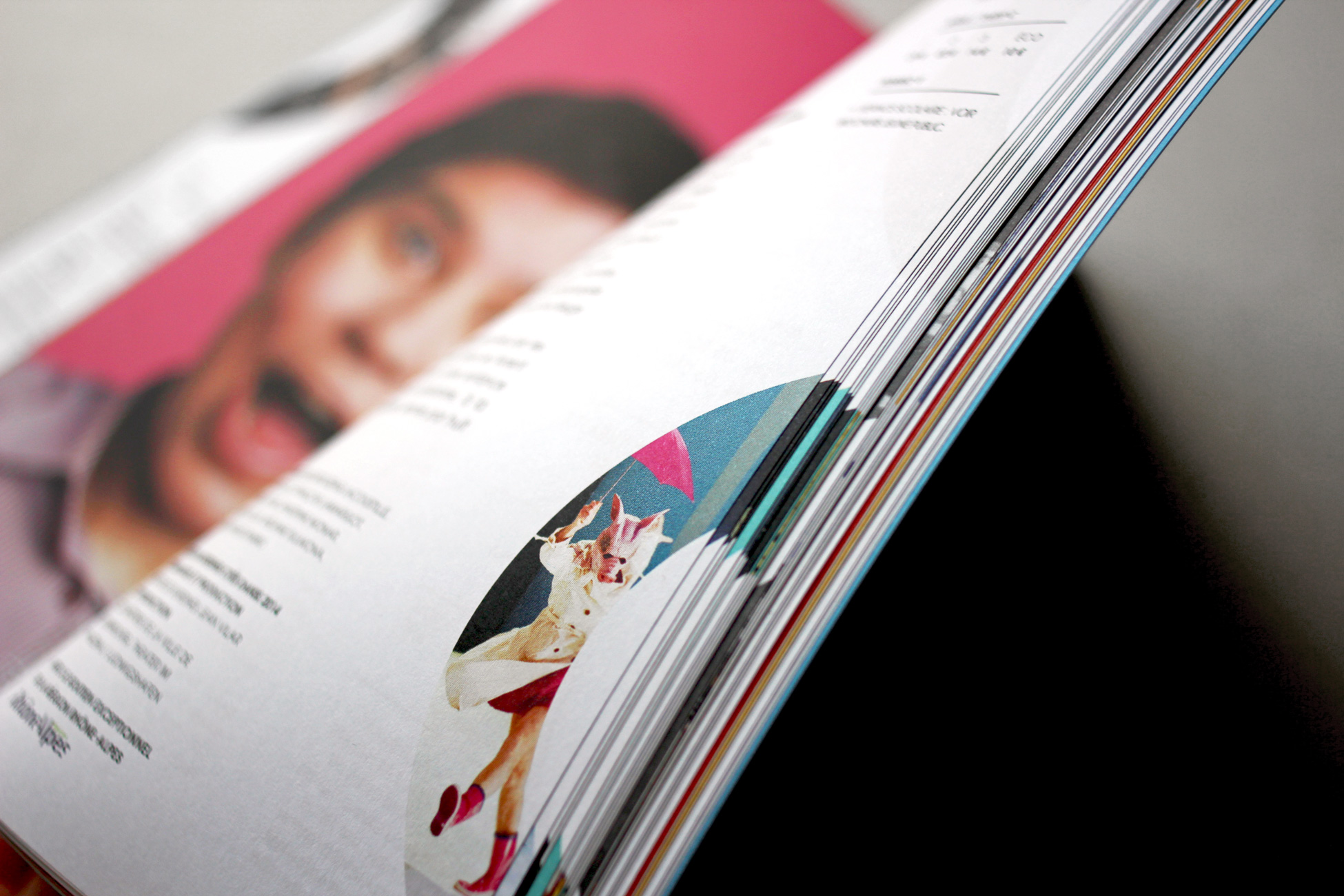
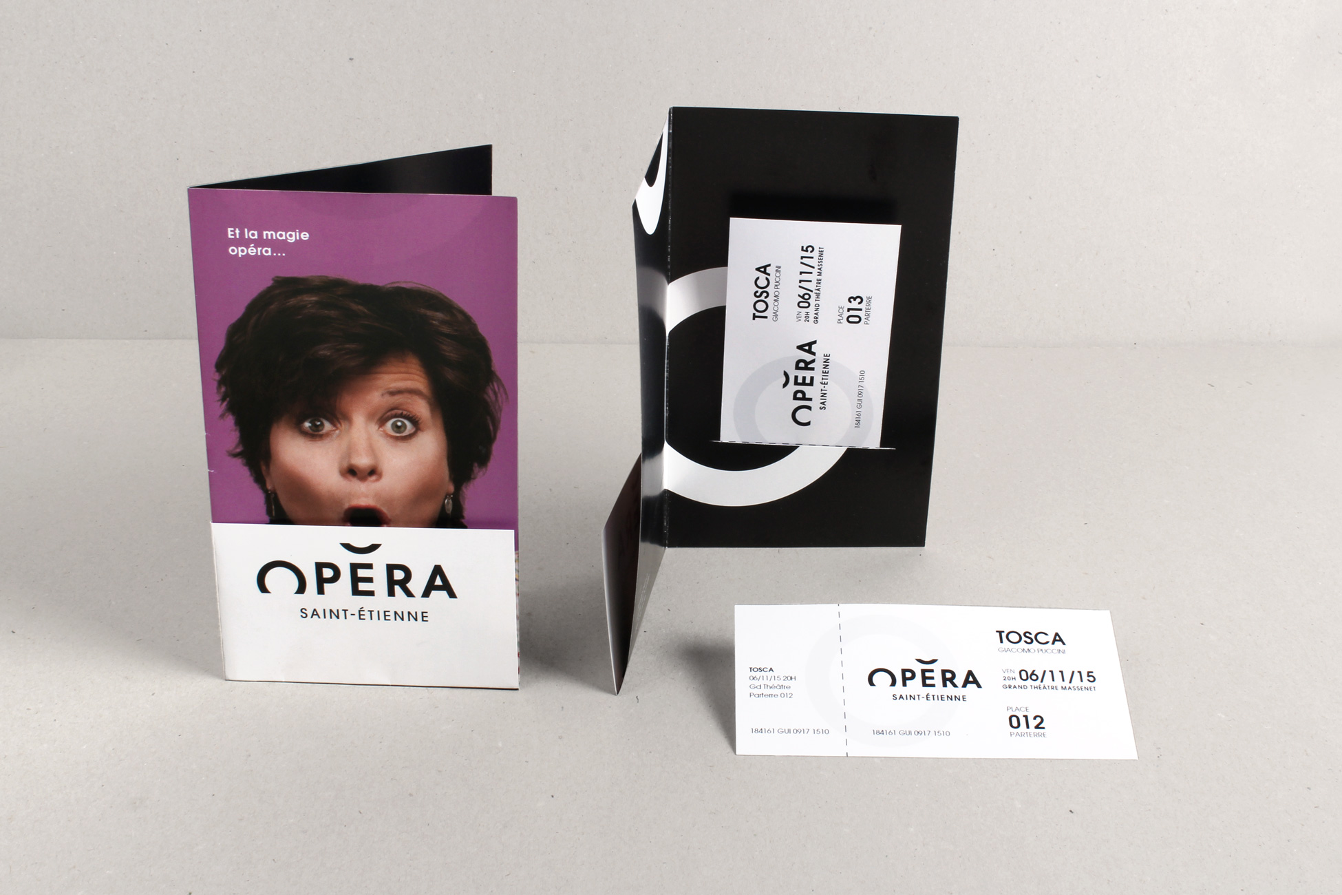
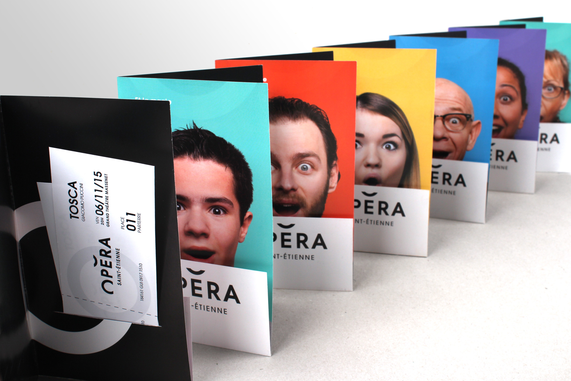
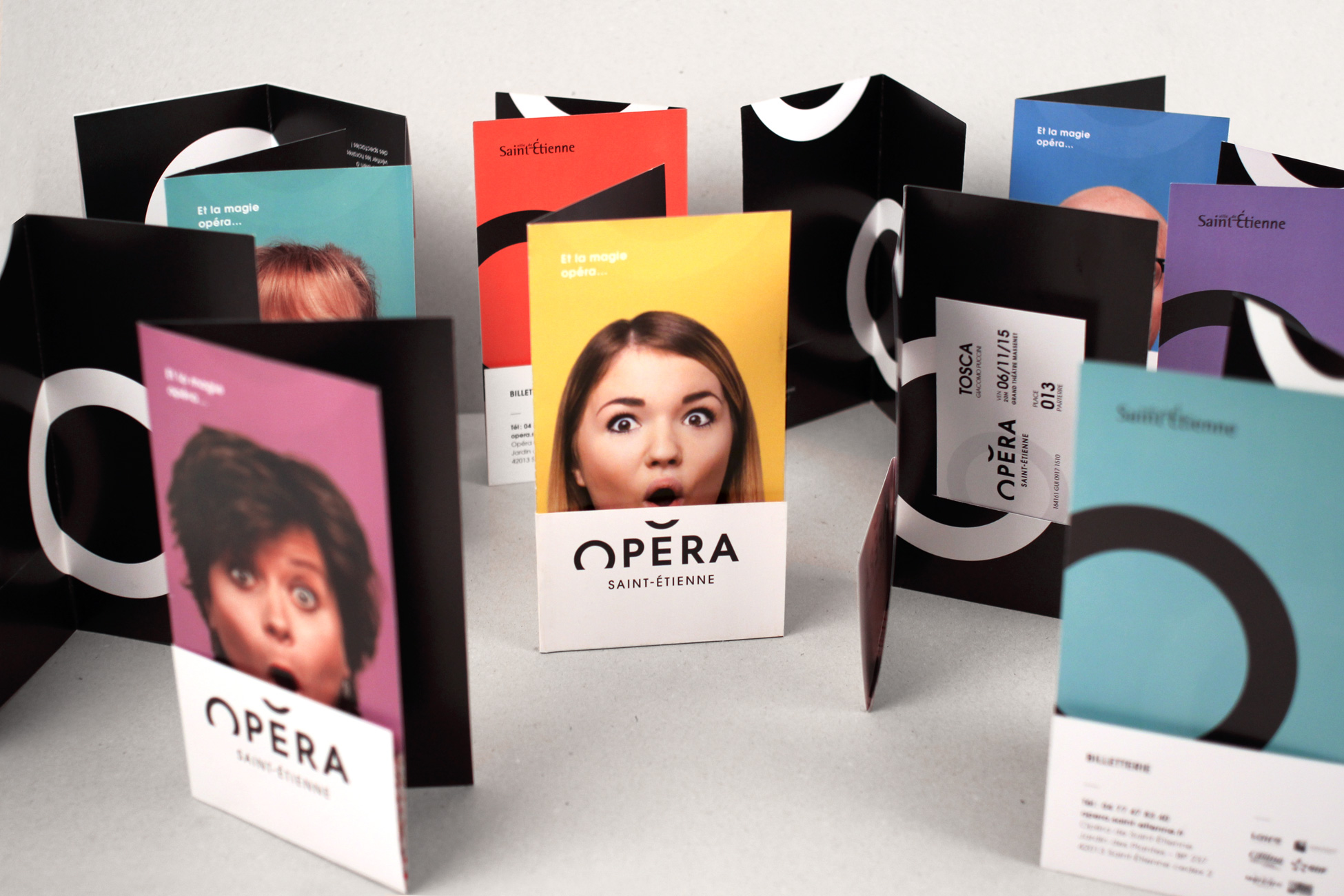
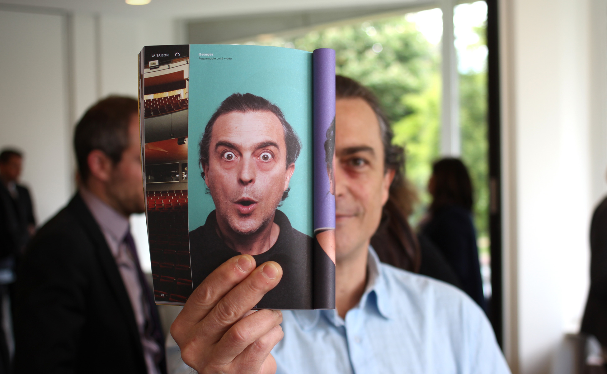
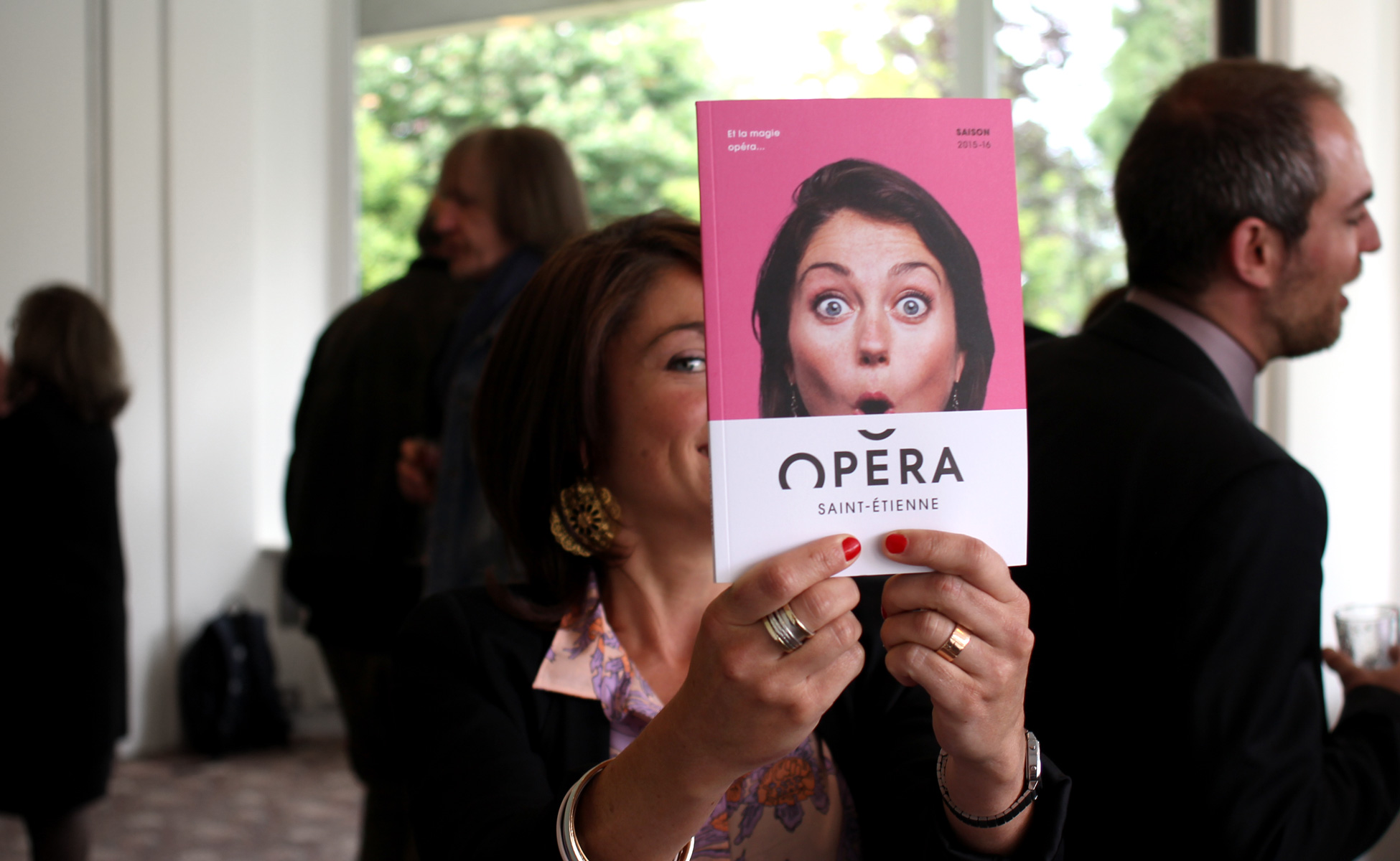
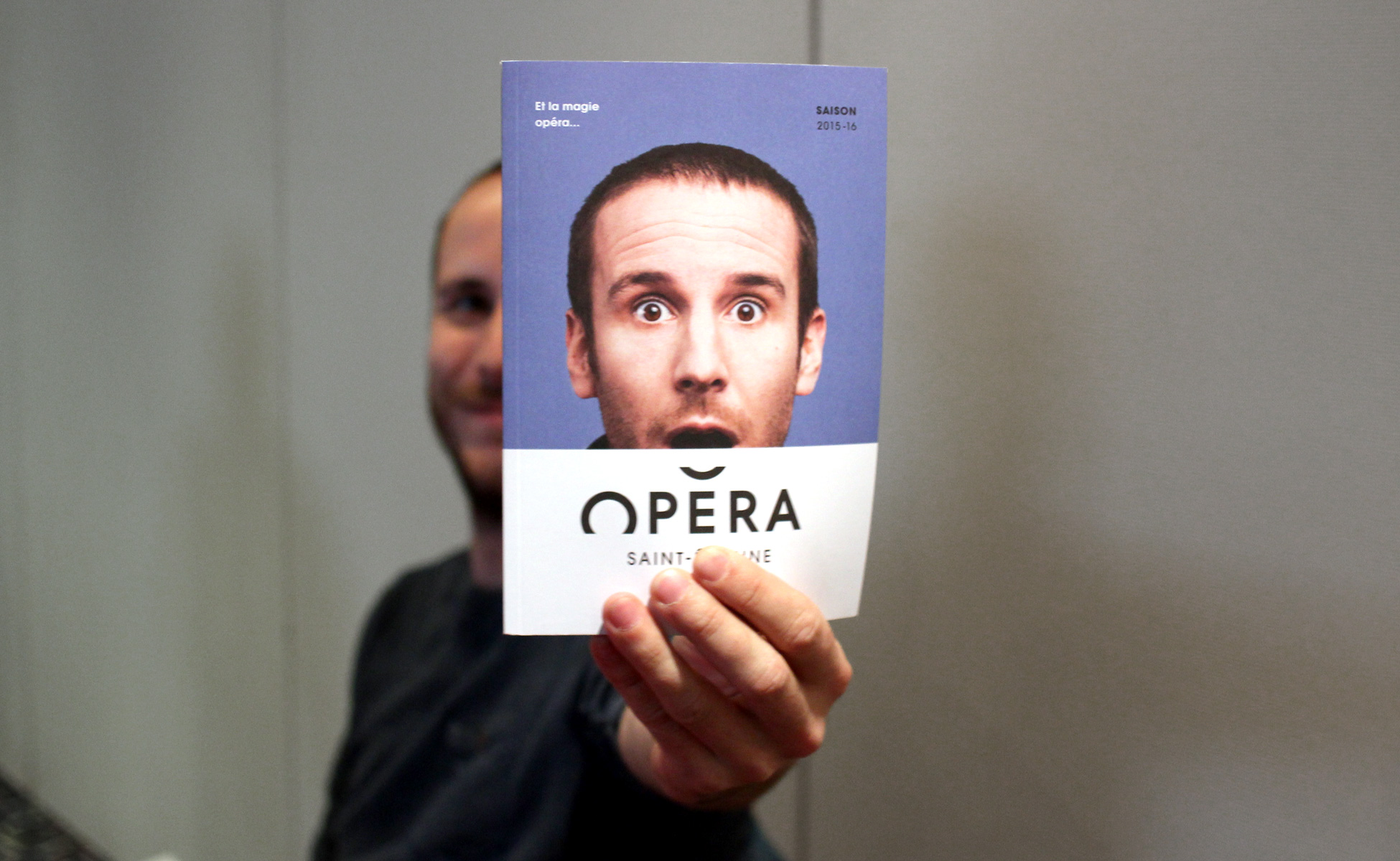
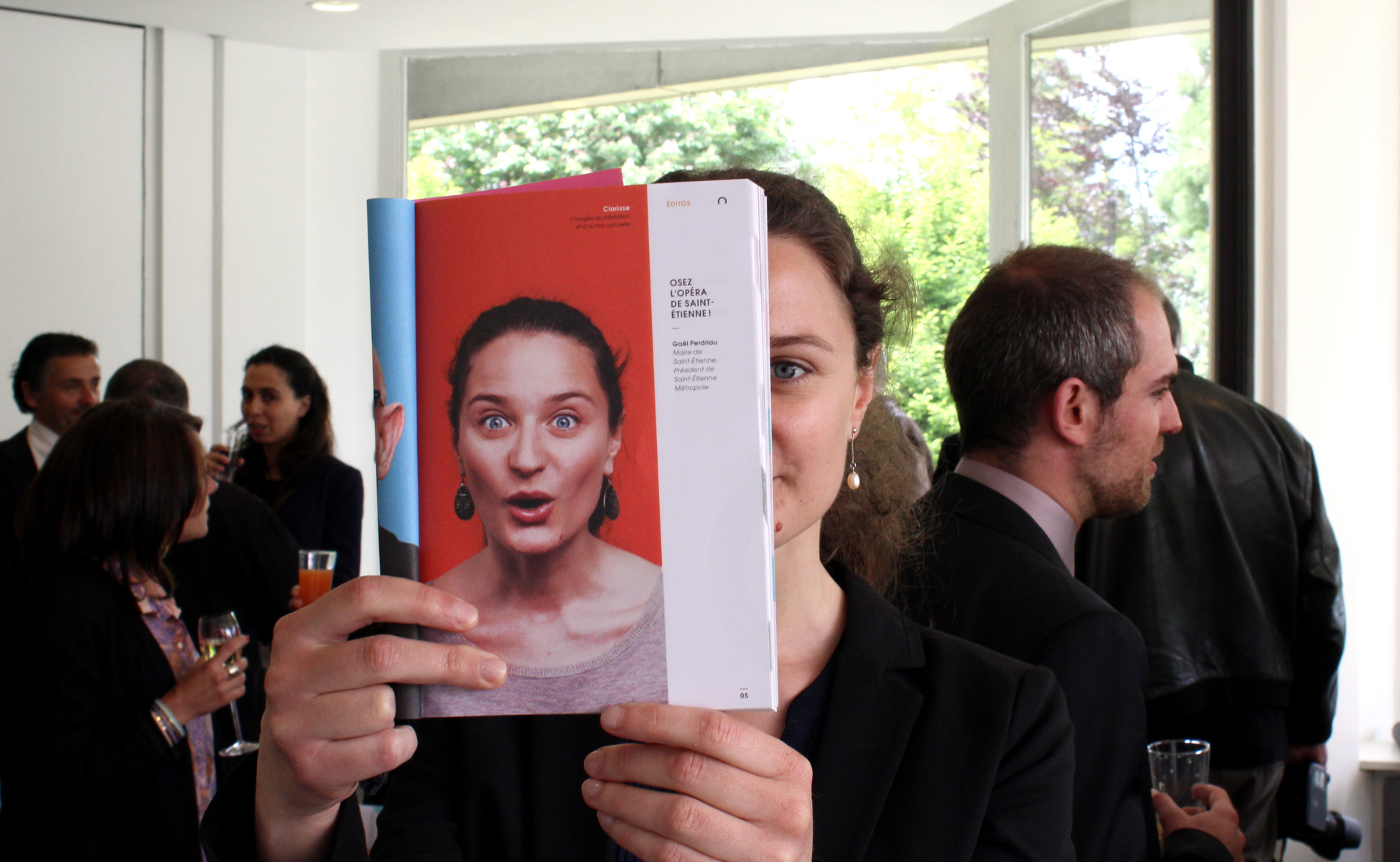
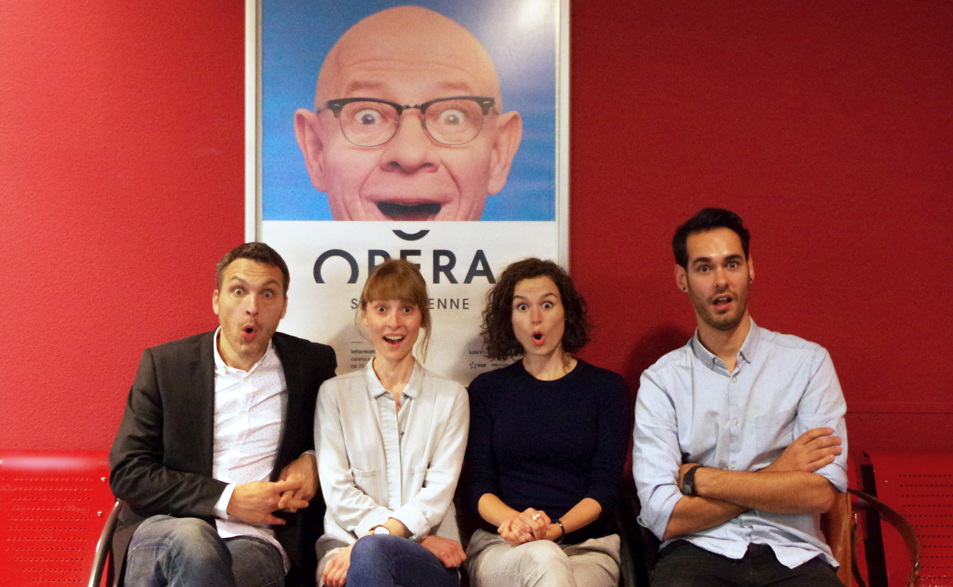
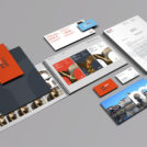
Last December we were commissioned to work on the new visual identity of the Saint-Étienne Opera House. After nearly six months of work, we are tremendously proud to unveil this project today.
With more than 150 curtain lifts for around 60 performances throughout the 2014-2015 season, the Saint-Étienne Opera House is a landmark of great cultural importance, a predominant player in the cultural life of the city.
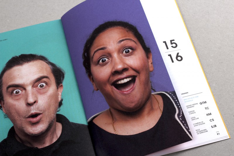
The objective laid out in this commission was to re-establish a sense of closeness with the people of Saint-Étienne through simple and down-to-earth communication. The main change was forgoing the “Opera-Theatre” name in favour of “Saint-Étienne Opera” to reflect an image of a traditional Opera House for its aficionados, but also to draw in potential opera-goers. As for the theatre programme, it has been put in the hands of the recently reopened “Comédie de Saint-Étienne”.














 San Serriffe typographic Island
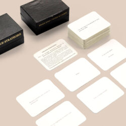 Design, creativity and oblique strategies!
 Tote bag, a new social totem?
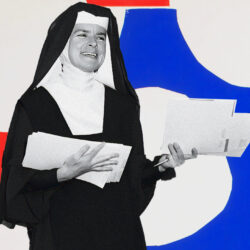 Sister Corita Kent, the Pop Art nun
 Donald Trump, the martyr who makes history
 L’Influx – Visual identity
 Brest Bretagne Handball – Brand identity
 Artline Institute, school of creation – Brand identity
 City of Claye-Souilly
 Groupe Qualiconsult – Visual identity
 Californian vibes for the 2019 Printemps de Pérouges festival
 Louvre Abu Dhabi’s new visual identity
 Typorama #03 : Didot, in fashion since 1811 !
 Reza Abedini, father of iranian contemporary graphic design
 An island shaped like an April fool’s
Artcelis like this just make me want to visit your website even more.