
In this article we will present you with a visual identity project that goes off the beaten track. An adventure of collective design that was an opportunity to question the role of visual identity outside the traditional institutional and commercial fields. Our challenge was to try to answer the question:
What would a horizontal, participative and inclusive visual identity look like?
An exciting question that goes far beyond the initial scope of the project and questions co-creation and the notion of authority. Strangely, the word "authority" derives from Latin from Latin auctoritas, meaning the ability to make people grow (verticality!). Anyway... we're not going to tell you everything in the introduction!
We will therefore present you in detail this adventure of the Autre Soie.
The article is long, impatients are allowed to scroll down to discover the design result. For others, we hope that reading this article will inspire you, and that you will want to participate by drawing.
To facilitate your navigation in the article, here is a short summary:


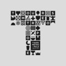
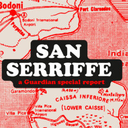 San Serriffe typographic Island
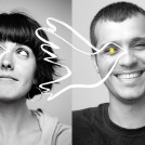
 Design, creativity and oblique strategies!
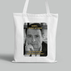 Tote bag, a new social totem?
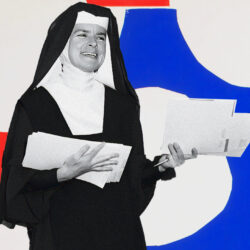 Sister Corita Kent, the Pop Art nun
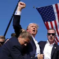 Donald Trump, the martyr who makes history
 Twipi Group brand architecture
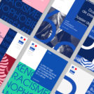 French Ministry of Culture – Visual identity
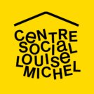 Louise Michel Social Centre – Visual identity
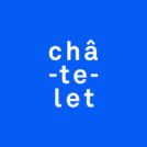 Châtelet, Musical Theater of Paris – Brand identity system
 La Poule Noire Brewery – Brand design
 Maurits Escher’s impossible reality
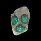 Picture stones, fascinating natural wonders
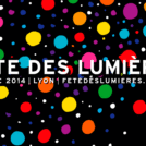 Tutorial: Poster Festival of Lights (part2)
 Y2K trend, the 2000’s style is back
Leave a Reply